

TL;DR: Don't overthink it. Keep it simple.
There’s no denying that there’s a huge market to be a logo and brand designer. It feels like since COVID, small businesses have popped up threefold and almost everyone on Instagram designs logos now.
But what makes a good logo anyway?
Whether you’re looking to get a logo designed or you are the designer and simply don’t know where to start, there are three essential factors to keep in mind. Ensuring that your logo is scalable, simple, and timeless will contribute to its effectiveness and longevity. Let's explore these aspects in more detail:
A logo should maintain its integrity and remain easily identifiable at any size. This means that whether it's displayed on a small business card or a large billboard, it should still capture the essence of your brand.
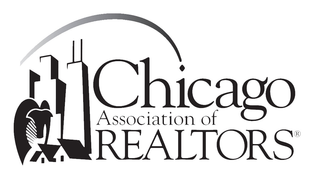
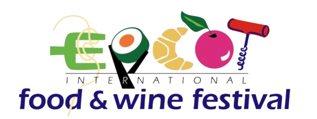
See this logo in Example 1, from the Chicago Association of Realtors. When it's presented at a certain size, you can read and see all the details. But let's use it in a business card, Example 2.

Doesn't quite work out, right? What does it say under Chicago? And the details of the city could very well be the skyline of any city really. This logo is a good example of what NOT to do.
Avoid including too many intricate details or using hard-to-read fonts, as they can become problematic when scaled down. Remember, if a potential client can't read or recognize your logo, they may simply move on.
The power of simplicity cannot be overstated when it comes to logo design. By keeping your logo clean and uncluttered, you create a memorable and versatile visual identity.
Adding too many elements can confuse your audience and dilute the impact of your brand message. Instead, identify your key audience and design with them in mind. By focusing on simplicity, your logo can effectively convey the essence of your brand, making a lasting impression.
A logo should be designed to withstand the test of time. It's important to avoid falling into the trap of following design trends that may quickly become outdated. Trendy logos may initially appear attractive, but they tend to saturate the market and can make your brand blend in rather than stand out.
Ask yourself whether your logo looks too similar to another brand or if it truly represents the unique qualities of your own. A timeless logo will grow and evolve with your brand, maintaining its relevance and impact for years to come.
By prioritizing scalability, simplicity, and timelessness in your logo design, you ensure that it remains effective and resonates with your target audience. Remember, a logo is a visual representation of your brand, and it plays a crucial role in shaping public perception. Investing in a professionally-designed logo will contribute to the long-term success of your brand.
